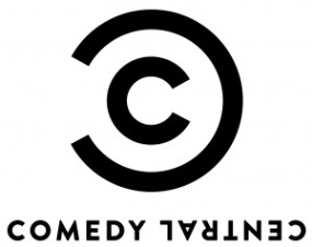
 After years of its iconic logo, Comedy Central is going the way of numerous other companies, and simplifying their logo. This time the company is playing on the copyright symbol, and simplifying it’s original look, which consisted of stretched out skyscraper, rising high off of the world.
The logo bears a striking resemblance to the carbon copy logo, also known as the copyright logo, that has been in use for decades. Senior Vice President of the network, Bob Salazar said the new logo represents the “irreverant wink” of the network.
“10 years, that was the last time we did anything this meaningful,” said Salazar. “If you think of social media, videogames, and the conventional competition, it has changed dramatically in the last 10 years. Even though the brand has never been as strong, we felt that refreshing it in our promotion and our branding, was something that we felt this moment in the network’s history would be the perfect time for.
I like the logo, but I’m not really sure the network needed such a big change. Although, with their biggest shows currently mock-news/pundit shows, it maybe was time for a new grown up logo.
What do you think of it? Let us know in the comments!
Watch the video about the logo below:
| Comedy Central Press | ||||
| Comedy Central: Refreshed and Rededicated | ||||
|
||||

1 Comment